|
|
JFreeChart を使ったグラフ作成 散布図(ScatterPlot) |
H.Kamifuji . |
- はじめに
散布図グラフの作成に関して確認します。散布図はデータに関連する2つの要素を軸に設定し、軸を設定したグラフ上にデータを点として表示するものです。適切な要素を軸に設定している場合、複数のデータを表示させると関連性を見つけることが出来ます。
当ページでは、Linux CentOS7 の Gnome で動作テストしています。
現在(2021/08)では、JDK-16.0.2 にアップされています。一部、上位互換について、見直しを行っていきます。
現在(2023/04)では、JDK-20.0.1 にアップされています。一部、上位互換について、見直しを行っていきます。
現在(2024/10)では、JDK-23 に、アップされています。JDK-23 + jfreechart-1.0.19 で、上位互換について、見直しを行っていきます。
- 目 次
- 散布図の作成(createScatterPlotメソッド)
[ 目次 ]
散布図の基本的な作成方法を確認します。
まずChartFactoryクラスの「createScatterPlot」メソッドを使って散布図を扱うJFreeChartクラスのオブジェクトを作成します。
createScatterPlot
public static JFreeChart createScatterPlot(java.lang.String title,
                                           java.lang.String xAxisLabel,
                                           java.lang.String yAxisLabel,
                                           XYDataset dataset,
                                           PlotOrientation orientation,
                                           boolean legend,
                                           boolean tooltips,
                                           boolean urls)
Creates a scatter plot with default settings. The chart object returned by this method uses an XYPlot instance as the plot, with a NumberAxis for the domain axis, a NumberAxis as the range axis, and an XYLineAndShapeRenderer as the renderer.
Parameters:
title - the chart title (null permitted).
xAxisLabel - a label for the X-axis (null permitted).
yAxisLabel - a label for the Y-axis (null permitted).
dataset - the dataset for the chart (null permitted).
orientation - the plot orientation (horizontal or vertical) (null NOT permitted).
legend - a flag specifying whether or not a legend is required.
tooltips - configure chart to generate tool tips?
urls - configure chart to generate URLs?
Returns:
A scatter plot.
1番目の引数にグラフのタイトルを文字列で指定します。
2番目の引数にはX軸のラベルを文字列で指定します。3番目の引数にはY軸のラベルを文字列で指定します。
4番目の引数にはグラフのデータをXYDatasetインターフェースを実装したクラスのオブジェクトで指定します。今回はXYSeriesCollectionクラスを使います。詳細は次のページで確認します。
5番目の引数には棒グラフの向きを指定します。指定可能な値はorg.jfree.chart.plot.PlotOrientationクラスで定義されており、次のどちらかとなります。
PlotOrientation.VERTICAL    値を表す軸がY軸
PlotOrientation.HORIZONTAL  値を表す軸がX軸
6番目の引数には凡例を表示するかどうかを「true」か「false」で指定します。
7番目の引数にはツールチップを作成するかどうかを「true」か「false」で指定します。
8番目の引数にはURLを作成するかどうかを「true」か「false」で指定します。
実際の使い方は次のようになります。
XYSeriesCollection data = new XYSeriesCollection();
JFreeChart chart = ChartFactory.createScatterPlot("来店者傾向",
                                                "気温",
                                                "人数",
                                                data,
                                                PlotOrientation.VERTICAL,
                                                true,
                                                false,
                                                false);
実際のデータの追加方法は次のページで確認します。
では簡単なサンプルを作成して試してみます。
サンプルプログラム
下記のサンプルを実行してみよう。
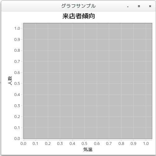
/**
 * 散布図の作成(createScatterPlotメソッド)
 */
import org.jfree.chart.JFreeChart;
import org.jfree.chart.ChartFactory;
import org.jfree.data.xy.XYSeriesCollection;
import org.jfree.chart.plot.PlotOrientation;

import javax.swing.JFrame;
import java.awt.BorderLayout;
import org.jfree.chart.ChartPanel;

public class Test1_1 extends JFrame{
  public static void main(String[] args) {
    Test1_1 frame = new Test1_1();

    frame.setDefaultCloseOperation(JFrame.EXIT_ON_CLOSE);
    frame.setBounds(10, 10, 500, 500);
    frame.setTitle("グラフサンプル");
    frame.setVisible(true);
  }

  Test1_1(){
    XYSeriesCollection data = new XYSeriesCollection();
    JFreeChart chart =
      ChartFactory.createScatterPlot("来店者傾向",
                                     "気温",
                                     "人数",
                                     data,
                                     PlotOrientation.VERTICAL,
                                     true,
                                     false,
                                     false);

    ChartPanel cpanel = new ChartPanel(chart);
    getContentPane().add(cpanel, BorderLayout.CENTER);
  }
}
上記をコンパイルした後で実行すると次のように表示されます。
- 散布図のデータ(XYSeriesCollectionクラス)
[ 目次 ]
散布図では系列を作成し個々のデータを系列に登録していきます。そして全ての系列を系列コレクションに追加します。
まずは系列コレクションを表すXYSeriesCollectionクラスのオブジェクトを作成します。
XYSeriesCollectionクラスのクラス図は次のようになっています。
java.lang.Object
 |
 +- org.jfree.data.general.AbstractDataset
     |
     +- org.jfree.data.general.AbstractSeriesDataset
         |
         +- org.jfree.data.xy.AbstractXYDataset
             |
             +- org.jfree.data.xy.AbstractIntervalXYDataset
                 |
                 +- org.jfree.data.xy.XYSeriesCollection

public class XYSeriesCollection extends AbstractIntervalXYDataset implements IntervalXYDataset,
                                DomainInfo, org.jfree.util.PublicCloneable, java.io.Serializable
コンストラクタは2つ用意されています。デフォルトのコンストラクタは次のようになっています。
XYSeriesCollection
public XYSeriesCollection()
Constructs an empty dataset.
次のようにオブジェクトを作成します。
XYSeriesCollection data = new XYSeriesCollection();
系列の登録
系列はXYSeriesクラスを使用します。クラス図は次のようになっています。
java.lang.Object
 |
 +- org.jfree.data.general.Series
     |
     +- org.jfree.data.xy.XYSeries

public class XYSeries extends Series implements java.lang.Cloneable, java.io.Serializable
XYSeriesクラスのコンストラクタは3つ用意されています。系列名だけを指定するコンストラクタについて見てみます。
XYSeries
public XYSeries(java.lang.Comparable key)
Creates a new empty series. By default, items added to the series will be sorted into ascending order by x-value, and duplicate x-values will be allowed (these defaults can be modified with another constructor.
Parameters:
key - the series key (null not permitted).
引数には系列の名前を指定します。
XYSeriesクラスのオブジェクトを作成したらXYSeriesCollectionクラスで用意されている「addSeries」メソッドを使って系列を追加していきます。
addSeries
public void addSeries(XYSeries series)
Adds a series to the collection and sends a DatasetChangeEvent to all registered listeners.
Parameters:
series - the series (null not permitted).
引数には系列を表す「XYSeries」クラスのオブジェクトを指定します。
実際には次のように記述します。
XYSeriesCollection data = new XYSeriesCollection();

XYSeries series = new XYSeries("動物園");
data.addSeries(series);
これで系列が出来ました。最後に系列毎にデータを登録していきます。
データの登録
系列にデータを登録するにはXYSeriesクラスで用意されている「add」メソッドを使います。
add
public void add(java.lang.Number x,
                java.lang.Number y)
Adds new data to the series and sends a SeriesChangeEvent to all registered listeners.
Throws an exception if the x-value is a duplicate AND the allowDuplicateXValues flag is false.
Parameters:
x - the x-value (null not permitted).
y - the y-value (null permitted).
1番目の引数と2番目の引数にデータ毎のX軸とY軸の値を指定します。
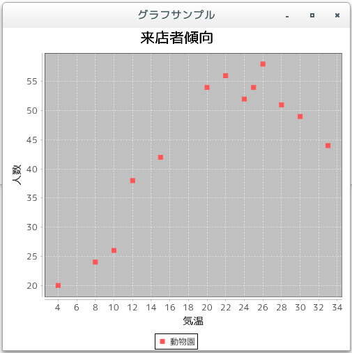
今回は次のようなデータを元にグラフを作成します。
X軸 Y軸 10 26 15 42 20 54 22 56 24 52 26 58 4 20 8 24 28 51 30 49 25 54 12 38 33 44
実際には次のように記述します。
XYSeriesCollection data = new XYSeriesCollection();

XYSeries series = new XYSeries("動物園");
series.add(10, 26);
series.add(15, 42);
series.add(20, 54);
/* データの数だけ実行 */

data.addSeries(series);
では簡単なサンプルを作成して試してみます。
サンプルプログラム
下記のサンプルを実行してみよう。
/**
 * 散布図のデータ(XYSeriesCollectionクラス)
 */
import org.jfree.chart.JFreeChart;
import org.jfree.chart.ChartFactory;
import org.jfree.data.xy.XYSeriesCollection;
import org.jfree.chart.plot.PlotOrientation;

import org.jfree.data.xy.XYSeries;

import javax.swing.JFrame;
import java.awt.BorderLayout;
import org.jfree.chart.ChartPanel;

public class Test2_1 extends JFrame{
  public static void main(String[] args) {
    Test2_1 frame = new Test2_1();

    frame.setDefaultCloseOperation(JFrame.EXIT_ON_CLOSE);
    frame.setBounds(10, 10, 500, 500);
    frame.setTitle("グラフサンプル");
    frame.setVisible(true);
  }

  Test2_1(){
    JFreeChart chart =
      ChartFactory.createScatterPlot("来店者傾向",
                                     "気温",
                                     "人数",
                                     createData(),
                                     PlotOrientation.VERTICAL,
                                     true,
                                     false,
                                     false);

    ChartPanel cpanel = new ChartPanel(chart);
    getContentPane().add(cpanel, BorderLayout.CENTER);
  }

  private XYSeriesCollection createData(){
    XYSeriesCollection data = new XYSeriesCollection();

    int xdata[] = {10, 15, 20, 22, 24, 26,  4,  8, 28, 30, 25, 12, 33};
    int ydata[] = {26, 42, 54, 56, 52, 58, 20, 24, 51, 49, 54, 38, 44};

    XYSeries series = new XYSeries("動物園");

    for (int i = 0 ; i < 13 ; i++){
      series.add(xdata[i], ydata[i]);
    }

    data.addSeries(series);

    return data;
  }
}
上記をコンパイルした後で実行すると次のように表示されます。
- 複数の系列のデータ
[ 目次 ]
散布図の場合は複数の系列のデータを取り扱うことが可能です。
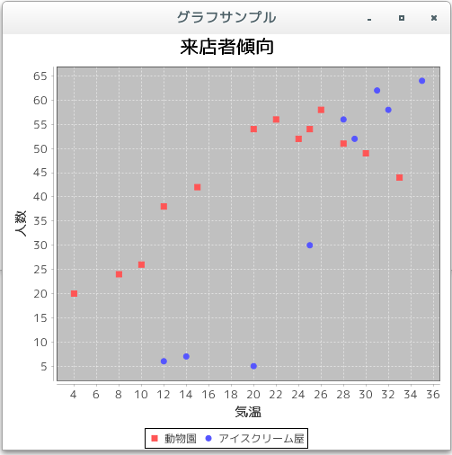
ここでは例として次の2つの系列を使ってみます。
動物園:
X軸 Y軸 10 26 15 42 20 54 22 56 24 52 26 58 4 20 8 24 28 51 30 49 25 54 12 38 33 44
アイスクリーム屋:
X軸 Y軸 29 52 14 7 12 6 20 5 28 56 35 64 32 58 31 62 25 30
散布図の場合には系列毎にXYSeriesクラスのオブジェクトを作成しXYSeriesCollectionクラスのオブジェクトに追加します。
XYSeriesCollection data = new XYSeriesCollection();

XYSeries series1 = new XYSeries("動物園");
XYSeries series2 = new XYSeries("アイスクリーム屋");

data.addSeries(series1);
data.addSeries(series2);
そして各系列毎にデータをXYSeriesクラスのオブジェクトに追加していきます。
実際には次のように記述します。
XYSeriesCollection data = new XYSeriesCollection();

XYSeries series1 = new XYSeries("動物園");
series1.add(10, 26);
series1.add(15, 42);
series1.add(20, 54);
/* データの数だけ実行 */

XYSeries series2 = new XYSeries("アイスクリーム屋");
series2.add(29, 52);
series2.add(14, 7);
series2.add(12, 6);
/* データの数だけ実行 */

data.addSeries(series1);
data.addSeries(series2);
では簡単なサンプルを作成して試してみます。
サンプルプログラム
下記のサンプルを実行してみよう。
/**
 * 複数の系列のデータ
 */
import org.jfree.chart.JFreeChart;
import org.jfree.chart.ChartFactory;
import org.jfree.data.xy.XYSeriesCollection;
import org.jfree.chart.plot.PlotOrientation;

import org.jfree.data.xy.XYSeries;

import javax.swing.JFrame;
import java.awt.BorderLayout;
import org.jfree.chart.ChartPanel;

public class Test3_1 extends JFrame{
  public static void main(String[] args) {
    Test3_1 frame = new Test3_1();

    frame.setDefaultCloseOperation(JFrame.EXIT_ON_CLOSE);
    frame.setBounds(10, 10, 500, 500);
    frame.setTitle("グラフサンプル");
    frame.setVisible(true);
  }

  Test3_1(){
    JFreeChart chart =
      ChartFactory.createScatterPlot("来店者傾向",
                                     "気温",
                                     "人数",
                                     createData(),
                                     PlotOrientation.VERTICAL,
                                     true,
                                     false,
                                     false);

    ChartPanel cpanel = new ChartPanel(chart);
    getContentPane().add(cpanel, BorderLayout.CENTER);
  }

  private XYSeriesCollection createData(){
    XYSeriesCollection data = new XYSeriesCollection();

    int xdata1[] = {10, 15, 20, 22, 24, 26,  4,  8, 28, 30, 25, 12, 33};
    int ydata1[] = {26, 42, 54, 56, 52, 58, 20, 24, 51, 49, 54, 38, 44};

    int xdata2[] = {29, 14, 12, 20, 28, 35, 32, 31, 25};
    int ydata2[] = {52,  7,  6,  5, 56, 64, 58, 62, 30};

    XYSeries series1 = new XYSeries("動物園");

    for (int i = 0 ; i < 13 ; i++){
      series1.add(xdata1[i], ydata1[i]);
    }

    XYSeries series2 = new XYSeries("アイスクリーム屋");

    for (int i = 0 ; i < 9 ; i++){
      series2.add(xdata2[i], ydata2[i]);
    }

    data.addSeries(series1);
    data.addSeries(series2);

    return data;
  }
}
上記をコンパイルした後で実行すると次のように表示されます。
- グラフの向きを変更
[ 目次 ]
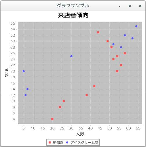
散布図ではX軸とY軸の表示する位置を入れ替えて表示することが可能です。「createScatterPlot」メソッドを使ってオブジェクトを作成する時の5番目の引数で指定します。
指定できる値は次のいずれかです。
PlotOrientation.VERTICAL
PlotOrientation.HORIZONTAL
PlotOrientation.VERTICALを指定した時は、X軸が下辺で左から右へ、そしてY軸が左辺で下から上へ表示されます。
PlotOrientation.HORIZONTALを指定した時は、X軸が左辺で下から上へ、そしてY軸が下辺で左から右へ表示されます。ちょうどPlotOrientation.VERTICALを指定した場合と比べてX軸とY軸の位置が逆になります。
実際には次のように記述します。
XYSeriesCollection data = new XYSeriesCollection();

JFreeChart chart =
      ChartFactory.createScatterPlot("来店者傾向",
                                     "気温",
                                     "人数",
                                     data,
                                     PlotOrientation.HORIZONTAL,
                                     true,
                                     false,
                                     false);
では簡単なサンプルを作成して試してみます。
サンプルプログラム
下記のサンプルを実行してみよう。
/**
 * グラフの向きを変更
 */
import org.jfree.chart.JFreeChart;
import org.jfree.chart.ChartFactory;
import org.jfree.data.xy.XYSeriesCollection;
import org.jfree.chart.plot.PlotOrientation;

import org.jfree.data.xy.XYSeries;

import javax.swing.JFrame;
import java.awt.BorderLayout;
import org.jfree.chart.ChartPanel;

public class Test4_1 extends JFrame{
  public static void main(String[] args) {
    Test4_1 frame = new Test4_1();

    frame.setDefaultCloseOperation(JFrame.EXIT_ON_CLOSE);
    frame.setBounds(10, 10, 500, 500);
    frame.setTitle("グラフサンプル");
    frame.setVisible(true);
  }

  Test4_1(){
    JFreeChart chart =
      ChartFactory.createScatterPlot("来店者傾向",
                                     "気温",
                                     "人数",
                                     createData(),
                                     PlotOrientation.HORIZONTAL,
                                     true,
                                     false,
                                     false);

    ChartPanel cpanel = new ChartPanel(chart);
    getContentPane().add(cpanel, BorderLayout.CENTER);
  }

  private XYSeriesCollection createData(){
    XYSeriesCollection data = new XYSeriesCollection();

    int xdata1[] = {10, 15, 20, 22, 24, 26,  4,  8, 28, 30, 25, 12, 33};
    int ydata1[] = {26, 42, 54, 56, 52, 58, 20, 24, 51, 49, 54, 38, 44};

    int xdata2[] = {29, 14, 12, 20, 28, 35, 32, 31, 25};
    int ydata2[] = {52,  7,  6,  5, 56, 64, 58, 62, 30};

    XYSeries series1 = new XYSeries("動物園");

    for (int i = 0 ; i < 13 ; i++){
      series1.add(xdata1[i], ydata1[i]);
    }

    XYSeries series2 = new XYSeries("アイスクリーム屋");

    for (int i = 0 ; i < 9 ; i++){
      series2.add(xdata2[i], ydata2[i]);
    }

    data.addSeries(series1);
    data.addSeries(series2);

    return data;
  }
}
上記をコンパイルした後で実行すると次のように表示されます。
- 散布図の描画領域(XYPlotクラス)
[ 目次 ]
グラフの描画領域を取得し、描画領域に対する設定を行っていきます。ファクトリメソッドを使ってJFreeChartクラスのオブジェクトを作成した場合は、JFreeChartクラスで用意されている「getPlot」メソッドを使ってPlotクラスのオブジェクトを取得します。
散布図の場合には、取得したPlotクラスのオブジェクトを、PlotクラスのサブクラスであるXYPlotクラスにキャストして取得して使います。時系列グラフの場合と同じですので、詳しくは「時系列グラフの描画領域(XYPlotクラス)」を参照して下さい。
例えば次のように記述します。
JFreeChart chart = ChartFactory.createScatterPlot(...);      /* 引数は省略 */

XYPlot plot = (XYPlot)chart.getPlot();
では簡単なサンプルを作成して試してみます。
サンプルプログラム
下記のサンプルを実行してみよう。
/**
 * 散布図の描画領域(XYPlotクラス)
 */
import org.jfree.chart.JFreeChart;
import org.jfree.chart.ChartFactory;
import org.jfree.data.xy.XYSeriesCollection;
import org.jfree.chart.plot.PlotOrientation;
import org.jfree.data.xy.XYSeries;

import javax.swing.JFrame;
import java.awt.BorderLayout;
import org.jfree.chart.ChartPanel;

import org.jfree.chart.plot.XYPlot;
import java.awt.Color;

public class Test5_1 extends JFrame{
  public static void main(String[] args) {
    Test5_1 frame = new Test5_1();

    frame.setDefaultCloseOperation(JFrame.EXIT_ON_CLOSE);
    frame.setBounds(10, 10, 500, 500);
    frame.setTitle("グラフサンプル");
    frame.setVisible(true);
  }

  Test5_1(){
    JFreeChart chart =
      ChartFactory.createScatterPlot("来店者傾向",
                                     "気温",
                                     "人数",
                                     createData(),
                                     PlotOrientation.VERTICAL,
                                     true,
                                     false,
                                     false);

    XYPlot plot = (XYPlot)chart.getPlot();
    plot.setBackgroundPaint(Color.ORANGE);

    ChartPanel cpanel = new ChartPanel(chart);
    getContentPane().add(cpanel, BorderLayout.CENTER);
  }

  private XYSeriesCollection createData(){
    XYSeriesCollection data = new XYSeriesCollection();

    int xdata1[] = {10, 15, 20, 22, 24, 26,  4,  8, 28, 30, 25, 12, 33};
    int ydata1[] = {26, 42, 54, 56, 52, 58, 20, 24, 51, 49, 54, 38, 44};

    int xdata2[] = {29, 14, 12, 20, 28, 35, 32, 31, 25};
    int ydata2[] = {52,  7,  6,  5, 56, 64, 58, 62, 30};

    XYSeries series1 = new XYSeries("動物園");

    for (int i = 0 ; i < 13 ; i++){
      series1.add(xdata1[i], ydata1[i]);
    }

    XYSeries series2 = new XYSeries("アイスクリーム屋");

    for (int i = 0 ; i < 9 ; i++){
      series2.add(xdata2[i], ydata2[i]);
    }

    data.addSeries(series1);
    data.addSeries(series2);

    return data;
  }
}
上記をコンパイルした後で実行すると次のように表示されます。
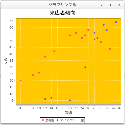
今回は例として描画領域の背景色をオレンジに変更しました。また上記のオレンジの箇所がグラフの描画領域となります。
- リリースノート
[ 目次 ]- 2024/10/20 Ver=2.05 JDK_23 + jfreechart-1.0.19 で確認
- 2023/04/25 Ver=2.03 JDK_20 で確認
- 2021/08/08 Ver=1.03 JDK_16 で確認
- 2020/10/25 Ver=1.02 JDK_15 で確認
- 2017/02/16 Ver=1.01 初版リリース
- 関連ページ
[ 目次 ]